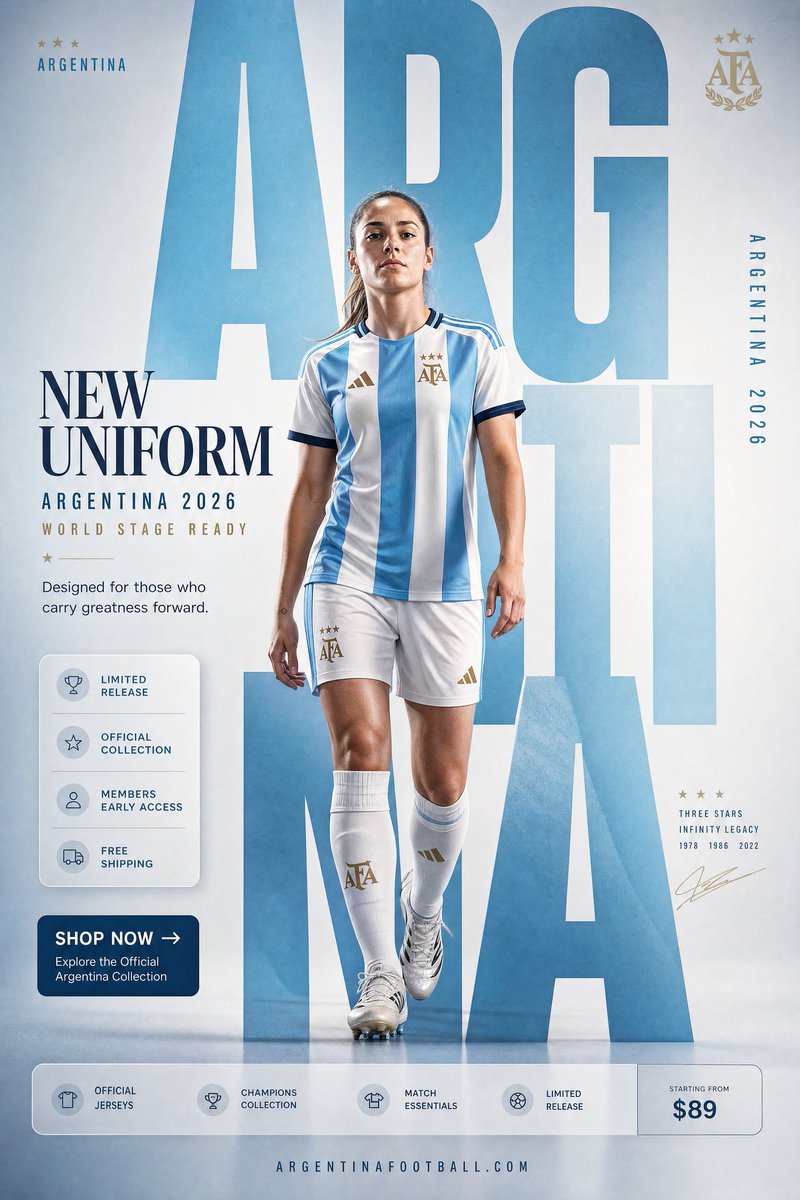
작성자 @AIwithAliya · 4:5 · poster
Argentina Football Uniform Promo
작성자 @AIwithAliya
Prompt
ARGENTINA NATIONAL TEAM "NEW UNIFORM" FORMAT Ultra-Premium Football Fashion SMM Promotional Poster Vertical 4:5 Instagram Hero Creative Global Sportswear Advertising Commercial Football Graphic Design Agency-Level Art Direction Behance Front Page Quality 8K UHD Hyper-Realistic Football × Fashion × Graphic Design Fusion Zero AI Slop Zero Generic Sports Posters Zero Match-Day Graphics Zero Editorial-Only Aesthetic CORE STRATEGY This is not a football poster. This is a national identity statement disguised as a uniform campaign. The design should feel like Argentina's biggest football billboard, a luxury sportswear campaign, and a World Cup legacy poster merged into one visual. The graphic design is equally important as the athlete. Typography is not decoration. Typography is architecture. CAMPAIGN IDEA "NEW UNIFORM" Not just a jersey. A symbol of legacy. A symbol of champions. A symbol worn by those who carry history forward. The uniform isn't being sold. The identity is. MASTER VISUAL Massive oversized ARGENTINA typography dominates the entire composition. The word: ARGENTINA occupies nearly 75% of the canvas. Typography is integrated into the design. Letters extend beyond frame edges. Some letters cropped. Some hidden behind the player. Some functioning as compositional structures. The typography should feel monumental. The official federation crest appears subtly integrated into the layout. HERO SUBJECT Elite female footballer. Natural beauty. Confident expression. Minimal makeup. Champion mentality. No smiling. No dramatic celebration. Relaxed confidence. Wardrobe: Argentina 2026 home jersey. Sky-blue and white stripes. Matching shorts. Premium football socks. Modern football styling. Clean elite-athlete aesthetic. POSE Player stepping through the giant typography. One foot slightly forward. Direct eye contact. Hands relaxed. Body partially intersecting typography. The feeling: She carries the weight of champio
Why this prompt works
The core instruction — ARGENTINA typography occupying nearly 75% of the canvas, with letters cropped at frame edges and hidden behind the player — treats type as architecture exactly as the prompt declares, which is what separates this from a generic match-day graphic. The player stepping through the giant letterforms creates depth and narrative in one pose, and the long list of negative directives (Zero AI Slop, Zero Generic Sports Posters, Zero Match-Day Graphics) actively steers GPT Image 2 away from cliché compositions. The restrained art direction for the athlete — no smiling, no dramatic celebration, relaxed confidence — keeps the campaign tone luxury rather than hype.
Variations to try
- ·Run the same typography-as-architecture system for another federation — swap the sky-blue stripes and crest for Brazil's yellow and green and reset the giant word to BRASIL.
- ·Pull the camera back so the full ARGENTINA word reads uncropped, shrinking the player to a small figure walking between the letters for a billboard-scale feel.
- ·Switch the hero to a goalkeeper in the alternate kit and let the gloves interact with a letterform for a different product story.
Style & lighting notes
Vertical 4:5 Instagram hero format where monumental typography is the composition — the sky-blue and white jersey stripes echo the national palette across the layout. The brief calls for hyper-realistic 8K rendering with agency-level art direction, so lighting should read as premium sportswear campaign rather than stadium broadcast, with the federation crest integrated quietly instead of stamped on top.